Flex display is one of css most important concept and its base but it's pretty tricky to understand, I remember struggling to use it at first, now I use it everywhere. I will be talking about css flexbox and their most important components.
What is css flexbox:
In simple words; a flexbox is a flexible box and layout that makes it easy to create a responsive layout and control items and boxes around a page.
Main / Cross Axis:
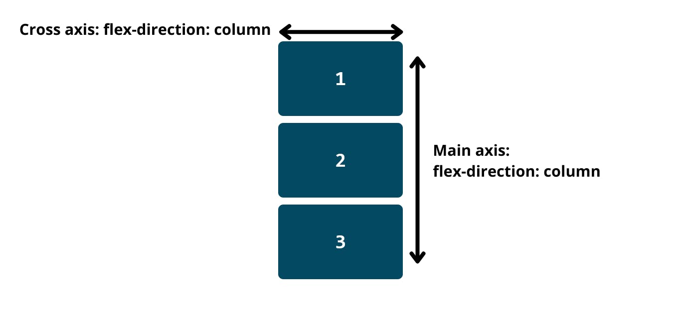
You will come across these two terms "main axis" and "cross axis" when learning about the flex container. Every css flex container has the two properties "main axis" & "cross axis".
Main axis
All items in a flex container are always laid out based on the direction of the main axis, in other words, main axis is the flex-direction property of css.
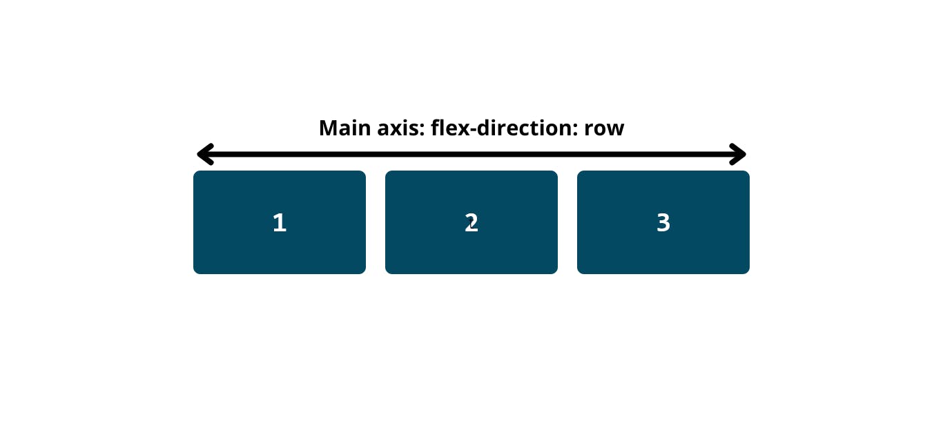
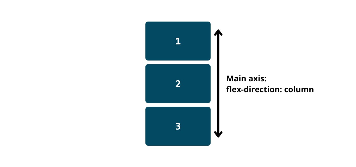
Main start & Main end
Each main axis got a main start and a main end. Items are place within the start and the end of the main axis.
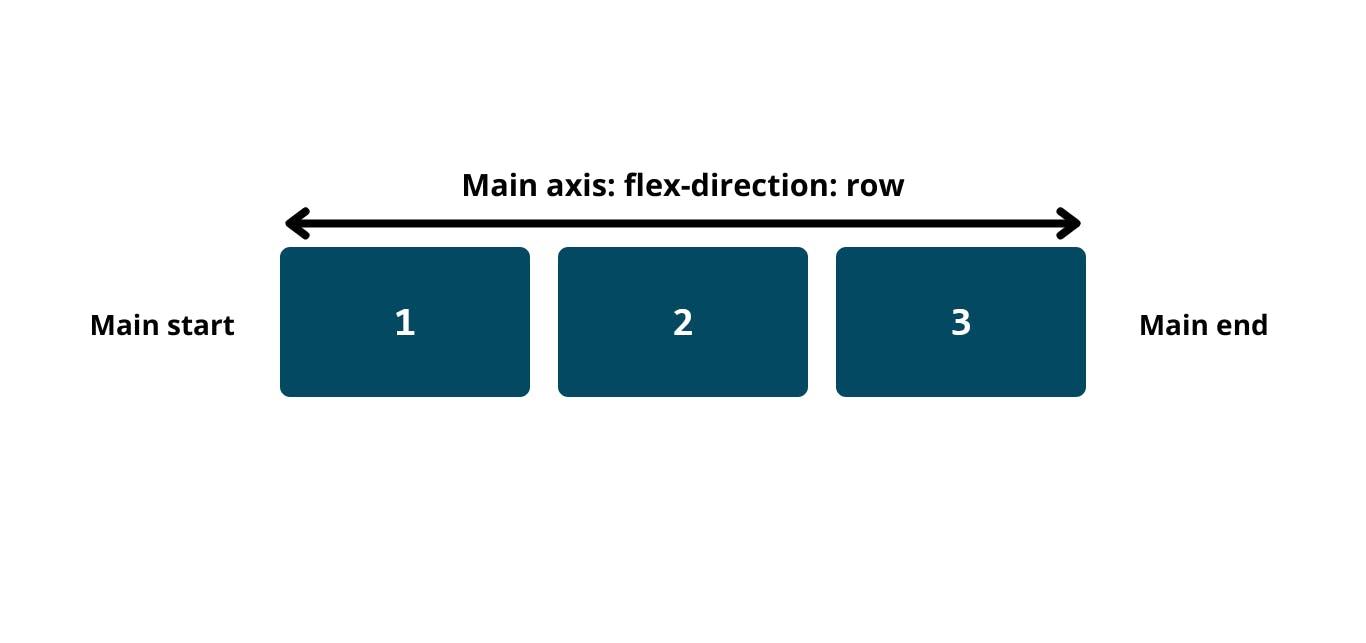
Cross axis
The cross axis always runs the opposite way of the main axis, it's in the name, it crosses the main axis. For example; if the main axis is a row, then the cross axis is vertical to the main axis, and vice versa.
Cross start & Cross end
It works the same as the Main start and main end, items are place withing the start and end of the cross axis.
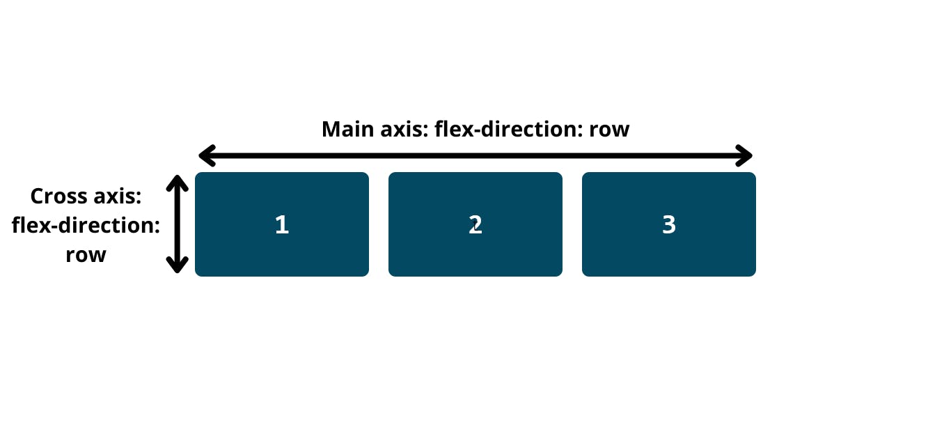
Justify content
Justify content is what aligns items on the main axis, it helps control the alignement of items on the page, justify content uses 6 values:
justify-content: start

justify-content: end

justify-content: center

justify-content: space-evenly

justify-content: space-between

justify-content: space-around

Align items / self
Align items
Align items, almost similair to Justify content yet different, is what aligns items on the cross axis, it uses 5 flex values:
align-items: flex-start
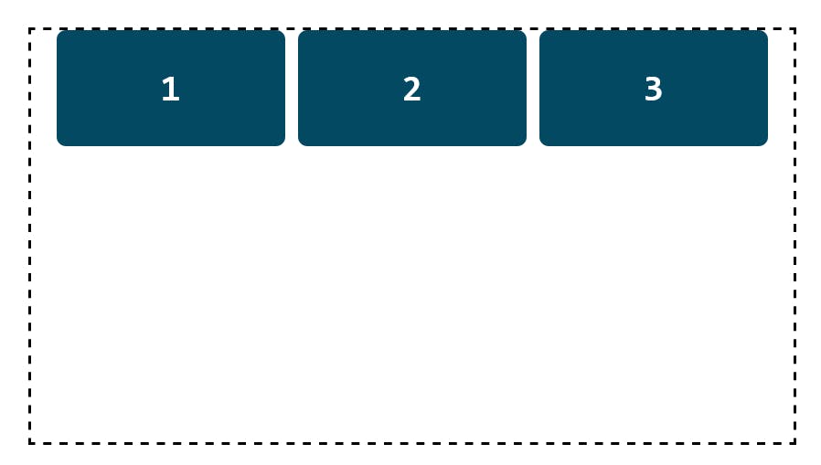
align-items: flex-end
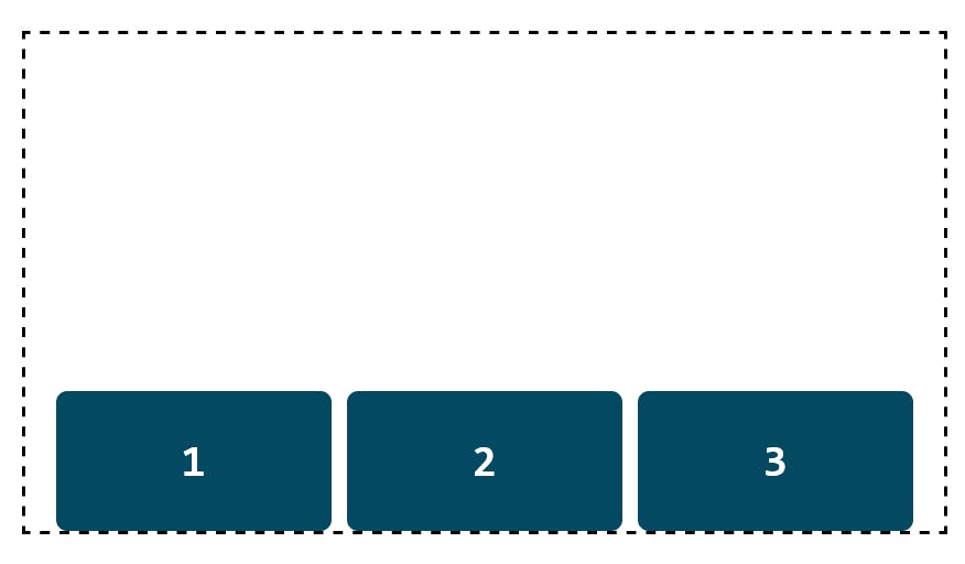
align-items: center
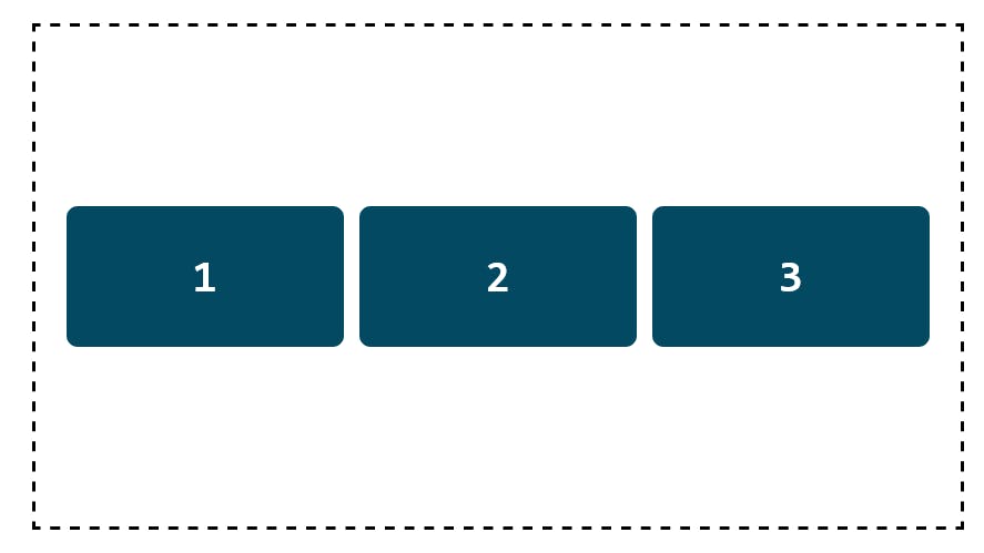
align-items: stretch
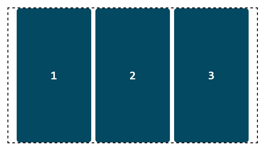
align-items: baseline
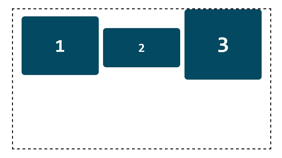
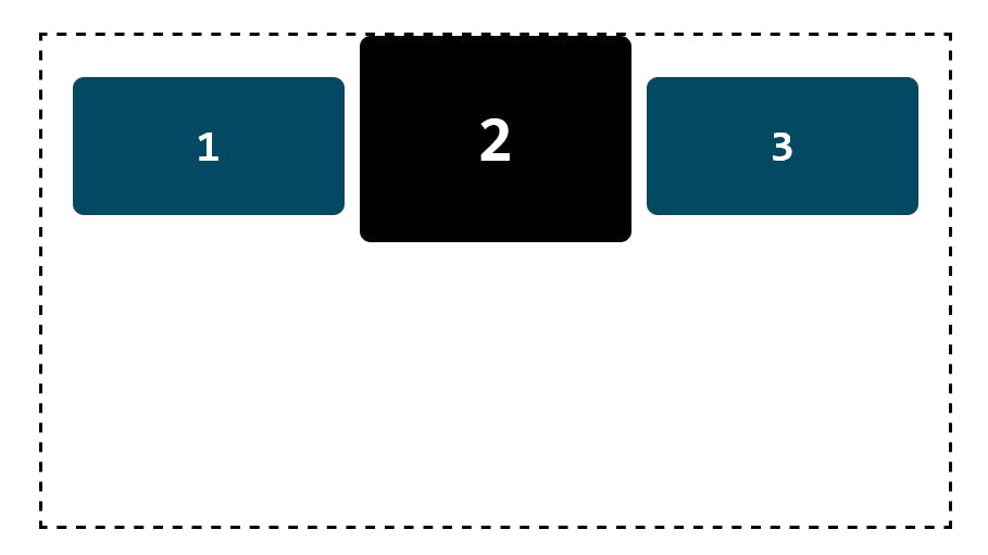
Align-items: baseline: sometimes the baseline and flex-start values behave the same way and that occures when the items are the same size. In the example above I changed the font-size of first and third boxes and it made a huge difference, the baseline value occures when the font size of an item is larger, it aligns them based on the largest element.
Align self
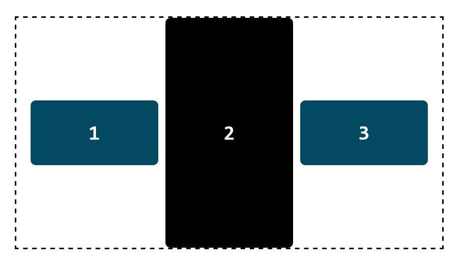
can be used for a single flex item, it overrides the main flex items property, basically it controls an item individually. I've set the second box to a black background and used it to display the align-self property. It uses 5 values:
align-self: flex-start
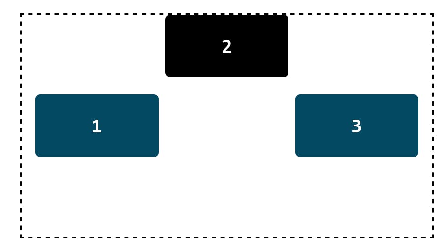
align-self: flex-end
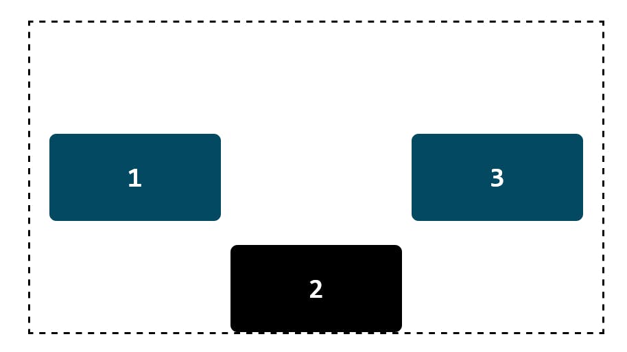
align-self: center
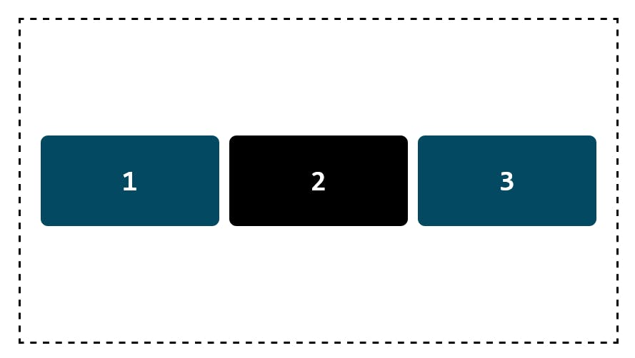
align-self: stretch
align-items: baseline
Flex Direction
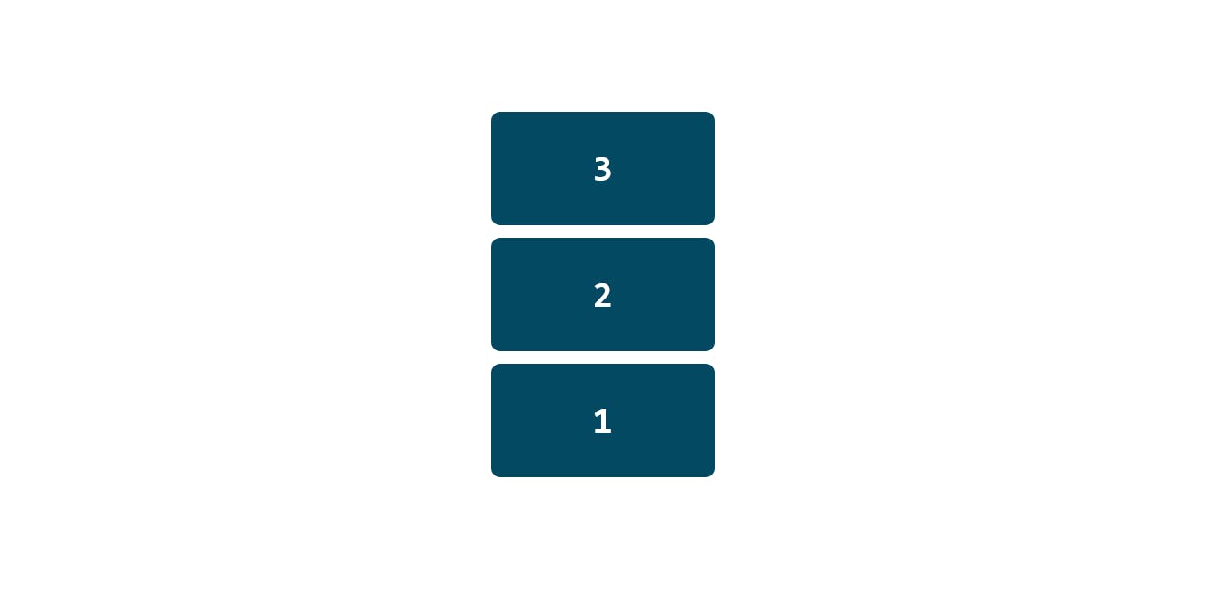
As I talked about above, the flex direction defines the main axis direction, there two main flex direction with a reversed one on each.
Column
flex-direction: column Aligns items from top to bottom.

flex-direction: column-reverse Align items from bottom to top, it basically reverses the order.
Row
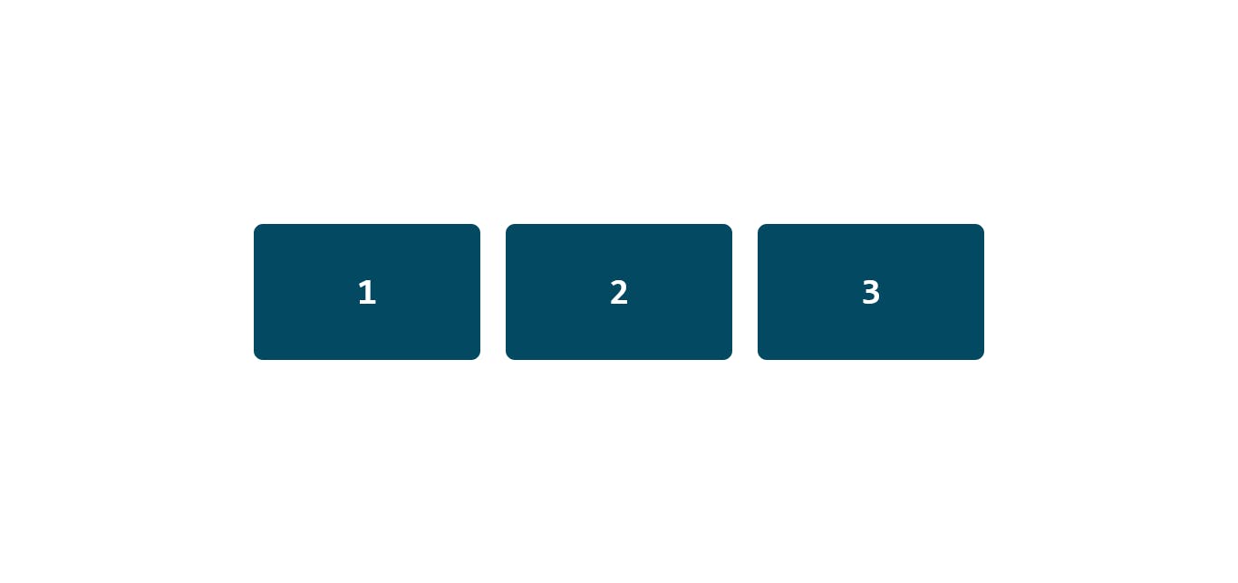
flex-direction: row Aligns items from left to right.
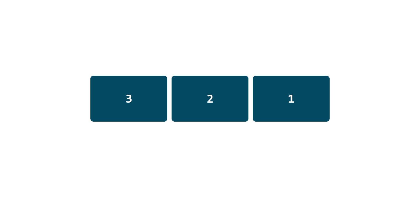
flex-direction: row-reverse Aligns items from right to left.
Flex-wrap
Flex-wrap means items inside a flex container will try and fit into one line as the page shrinks.
A flex container is set to flex-wrap: no-wrap by default, this can be change to two other properties that help to wrap items. It's pretty handy when working with responsivness.
The codepen below has a flex container with a flex-wrap property, check it out and try and shrink the page and you will notice the difference.
How to center elements using flexbox
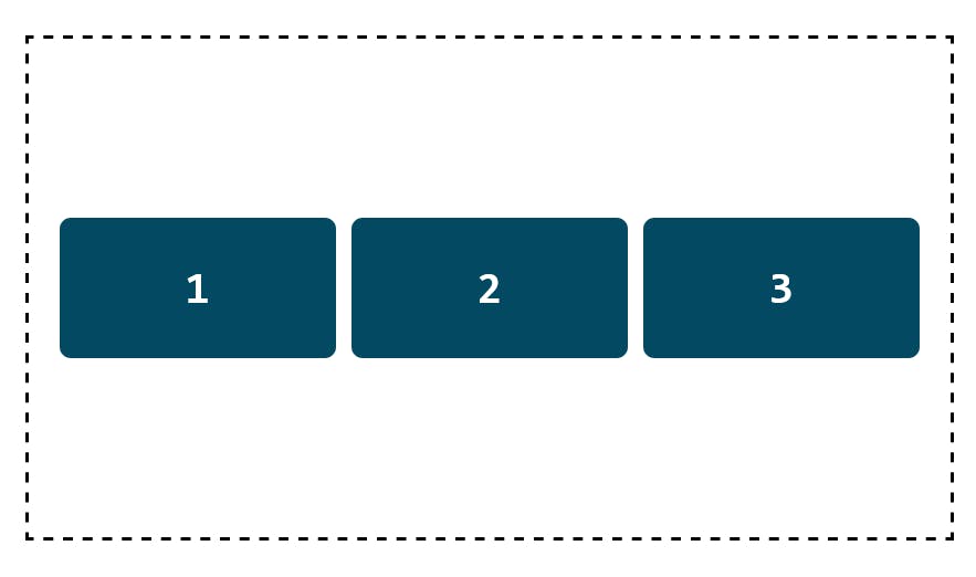
First thing that everyone should know is how to center a div in the middle of the page using css flexbox, it's really handy and easy. I use it all the time.
I created a parent div which holds three boxes, I added a width and height + set a background color for each box so it's visible and easy to understand.
- The first thing to do is to set the parent class to flex, the boxes will automatically be set to a horizontal row, then add the horizontal alignement by typing
justify-content:center, the three boxes will center horizontally in the page. - To center element vertically, first, you have to set a height to the page, it's prefered to set it to
min-height : 100vh, then add the followingalign-items: center. Without setting a height, the align-items won't work, it needs a height so that it centers the element.
That's it!
I only talked about the concepts that are used in almost evey flex container, and the ones that I remember getting stuck at. There few other ones that aren't stated above, make sure you also learn them too, they're as equally as important. I recommend checking out CSS-Tricks they have really simple css explanation and are really clear to follow up. Also, you can always find me on Twitter, so if you need any help or have a suggestion, be sure to come DM me there.